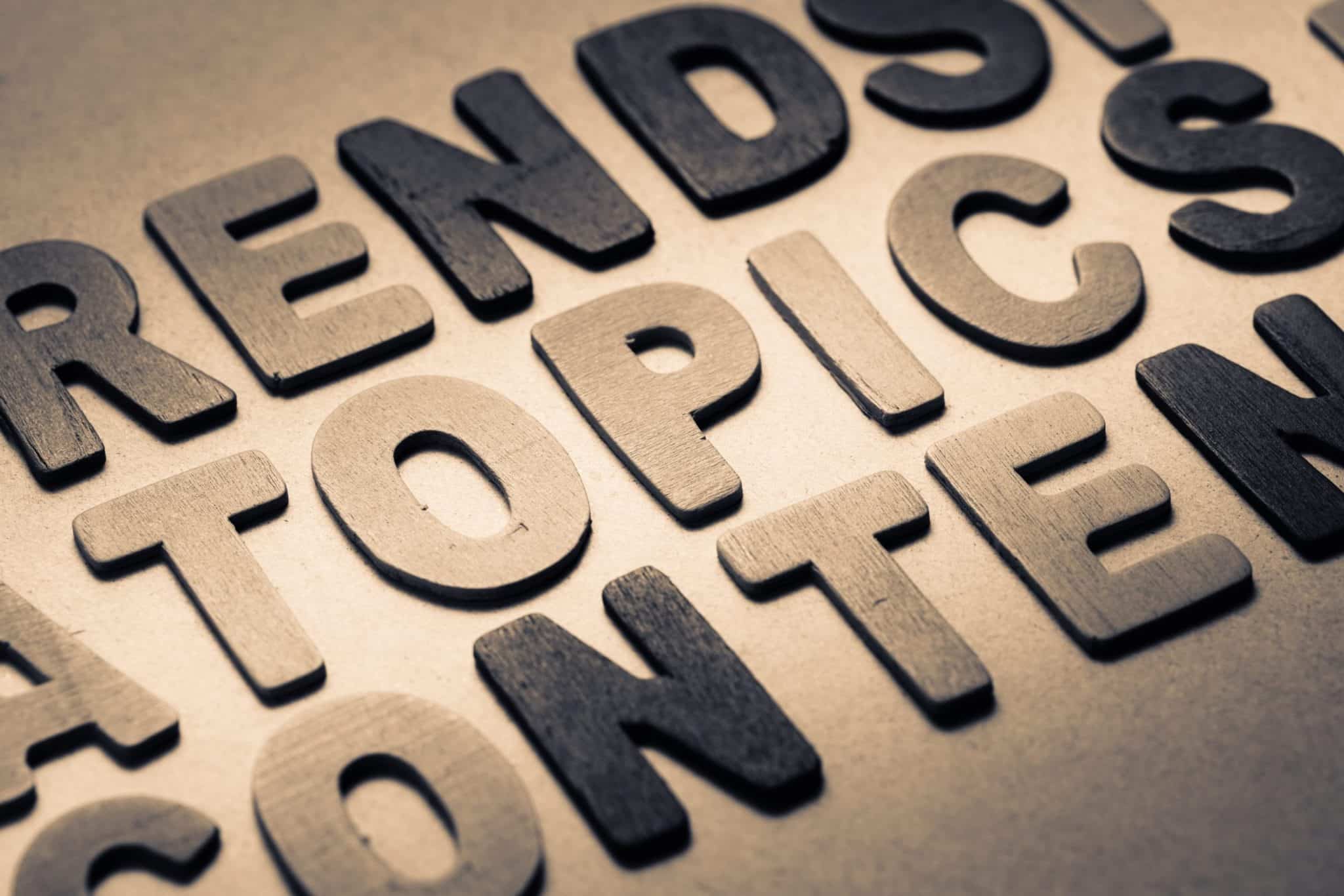
Typography is sometimes overlooked in web design, or in most cases, considered, but not considered nearly enough. Text is everywhere, from web design, to t-shirts, posters, and signs. The elements of a font can influence and determine how a viewer perceives a design, just as much as images, color, and other more noticeable web elements.
Almost every design blog I read, or have ever come across, has made at least one post on Typography-based design. Most of these are showcases, and while they are wonderful showcases, I don’t find many good resources on the concepts, or rules, behind making good Typography-based designs. That is what I’ll be emphasizing in this post, with a lesser emphasis on a small showcase.
What exactly is typography-based web design?
In web design, different elements work together to create an overall feel for the design. Typography, or the use of fonts and text in a design, is just one of these many elements. It’s importance is up there with images, color, and spacing. The style of a website’s typography should always be greatly considered in any design, and some websites are taking it to the next level with typography-based design.
Typography-based design does not mean you only have to use text in the design. This design style has the concept that the design as a whole focuses on the typography, and fonts and words are used for their color, shape, and size to create a unique and visually appealing design.
In other words, the typography of a typography-based design is now the main element in the design, and other elements such as color, spacing, and even images are only there to compliment the typography.
You can see that the poster design above is typography-based. It is almost nearly worlds, with the exception of the small darker circle in the center. The design has used varying color, font size and direction to give the poster a unique shape and feel.
Small Showcase
Even though I don’t want this post to mainly be a showcase on typography-based web design, I want to show you a few great examples. Notice how typography design can take on many different forms, from the most simplistic, to a creative use of fonts and imagery.

These designers are creative to say the least. It takes talent to turn text into art. So how do you achieve these designs for yourself? Here are a few concepts, rules, and resources to abide by.
Font Styles
Although their primary purpose is just to make words, fonts come with a lot of style. Just like people, fonts come with age, gender, time era, and a number of other features. I’ll go over a few of the basic font styles below, that are sometimes the most obvious.
Font Gender
Fonts have different genders, not literally, of course. Just like our society has gender roles, so do fonts. A more feminine font should be used appropriately with a design that uses femininity, or represents feminine ideas in some way. In the same way, masculine-styled fonts should be used appropriately.
Our brains can naturally tell the differences between these two, and why they are different, but being more aware of these differences will help you overall with typography-design. You’ll notice feminine fonts are usually lighter, ‘classier’ in some senses, or curvier. Masculine fonts are bulkier, blockier, and even the curves on masculine fonts have edges.
Most professional designs should lean more towards masculine fonts as they look more structured. Feminine fonts tend to provide more detail, emotion, and decoration, which can be bad for the look of a business. However, any design that is supposed to invoke emotion, creativity, or anything that wants to create a viewer’s reaction, should lean more towards a feminine font.
Font Era
A viewer may be confused, even if only subconsciously, if they saw a contemporary font next to a middle-aged font. Even the contemporary and futuristic fonts would look a bit out of place together. Like any font style, you can mix and match different fonts from let’s say, the retro style, but you can not cross-match them between significant eras like the retro style and the futuristic style.
Creative designs should use fonts from different eras, while professional designs should use various contemporary fonts. A contemporary font will say ‘I’m up-to-date, and I know what I’m doing’, which is obviously a plus for any professional look.
Font Age
Different font age styles are always great to work with, because most websites will appeal to a certain age group. These are great ways to appeal to an audience with a design.
I’ve used hand-written font examples here, but be aware that font age doesn’t necessarily mean it has to look like the age of the person who ‘wrote it.’ Obviously, a font representing space ships or toys would be more focused on a little boy. Anything that is professional, clean, and organized is more likely to represent an adult font age.
As you’ll notice font age is very dependent on gender. A little girl’s font looks much different than a little boy’s font. Keep this in mind when searching for a typography style.
Tutorials & Resources
Some of these are best practices, some are tutorials, others are just resources. Either way, you should learn something from all of them. A good typography designer knows various techniques to make typography-based design interesting.
Tips & Tricks
- With certain limits in place (minimal images, certain font style, etc.) this allows you branch out your creativity in new ways. Think of how to incorporate a logo style with only letters, or find a new and interesting way to layout the text on your webpage.
- Color, shape, and spacing are the three biggest web elements that should compliment the typography of the design.
- Good typography design sometimes means the typography is technically an image. Sometimes good typography means turning a basic font into a more interesting visual piece.
- Keep the font styles in mind. A contemporary Verdana will not go well with a old-fashioned Georgia. These are basic web-fonts, but still be aware of font styles even with the uncommon (or even custom) fonts.
- Typography-based design can come in a variety of shapes and forms. Always look for new interesting pieces of typography design for inspiration.
Have you ever made a typography-based design? It’s always great to hear of more tips from others, especially since typography design can vary so much.