Define Minimalism
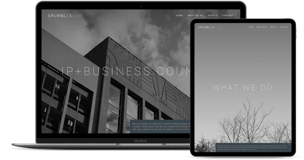
To start, think about what makes a website the opposite of minimalistic: A lot of colors, images, shapes, and not enough whitespace. Also, think in terms of content. Simplistic web design also strips the design of unnecessary content, so what a visitor does see, is what the visitor needs to see.
By subtracting the unnecessary elements in a web design, we create more meaning to the remaining pieces. What are those remaining pieces? Portfolio pieces, blog posts, a resume…you name it, it’s important.
Typography is a #1 Priority
Let’s think about what we do need in simplistic web design. Content, content, content. The number one way to dress up content is in the form of typography. Paying special attention to typography in simplistic design can create great aesthetic appeal by adding minor detail like italics, serifs, and defining spacing and proximity.

A List Apart features one of the greatest examples on the web of typography. It is obviously a very basic and minimalistic design, featuring black white, gray/beige and orange. The only image that is used in the logo, which is also minimalistic, and the majority of shape on the design is rectangular.
Looking closer at the design, we can see that the designer spent a lot of time thinking about typography. They first thought about the size of the headers, paragraphs, navigation, etc. relative to all other content. Then, color came into place. Notice how the brightest color on the page, orange, highlights the titles of fresh content.
There are other ways to highlight content with just typography. Bolding, italicizing, size, and font change all come into play. Using correct hierarchy in typography is also a must, so pay attention to proximity and spacing as well.
Boring Color? No. Little Color? Yes.
Many designers want to spice up simplistic web design with bright, interesting colors. However, as a general rule of thumb, a simplistic design should not use more than 2 colors in the actual design. This because pops of color create a strong contrast, opposed to weaker forms of contrast like a change in shape or size.

Janic Design uses two contrasting colors: green and orange. The rest of the design is variations in gray, and uses contrast to get the point across. Also notice that the bulk of the design are in these grays. Those bursts of color lead the eye to what is most important: logo, navigation, and portfolio content.
The only other colors in the design are in the portfolio pieces themselves, leading the eye even more. This strong contrast in color and style creates a design where the visitor sees the portfolio pieces first; this a great goal for any designer making a portfolio.
An Effective Use of Whitespace
Whitespace is often overlooked as such a big part of web design. Ever wonder why adding a bit of margins on the side of a layout makes it ten times more appealing? Whitespace frames whatever it’s around, meaning side margins frame an entire layout. This gives focus to the whole design.
Experienced designers know how to take the knowledge a bit further. Using whitespace to properly frame headers, intro text, content, and navigation can make for a more effective layout. A good designer knows how to influence their audience with their design, either to read the content, donate money, make a sale, or leave a comment. Whitespace is one of these biggest influences.
Whitespace is not only used to frame, but to also create a sense of feeling. The more whitespace there is, the lighter it feels, and the more luxurious it is. Luxury can be compared to professionalism, high-quality, and high-price.
The image above is from a very informative article from A List Apart: Whitespace. Mark Boulton goes into what exactly whitespace is, how to use it effectively, and a walkthrough of basic practices when working with whitespace. I highly suggest everyone read the article completely through:
What do You Think of Simplistic Design?
Share your thoughts, practices, and tips on simplistic design.
How do you use whitespace in design?
Do you have any special Typography tricks?
How important do you think the color is in minimalistic design?


