
Smartphones and other handheld devices contribute substantially to the overall viewership of any website. Latest estimates show that it is not long before the mobile Internet users are slated to have more stake in the website usage from their desktop and laptop counterparts.
In such a scenario it would be a cardinal sin to ignore the mobile users when it comes to development of a website. Thus one of the most important stages is making a website mobile friendly is to test it for different smartphone platforms and other handheld devices. Let us take a look the importance of mobile phone emulators when it comes to designing websites.
- A mobile phone emulator allows you to check the responsiveness and functionality of the mobile websites across different mobile platforms such as iPhone, Android, BlackBerry, iPad etc.
- Mobile emulators pinpoint the problems and issues concerning the website and allow you to take corrective measures to make the website visually appealing and functional on smartphones and other hand held devices.
- A mobile emulator eases the process of website testing and does away with the technique of testing the website on different devices. The developers can test the website on a virtual mobile interface with all the functionalities available on a device.
- Testing through mobile emulators works perfectly on touch based phones and the traditional QWERTY based smartphones.
There are a number of mobile phone emulators available in the market and here we’ll take a look at some of the most popular among them.
01. iPhone Tester
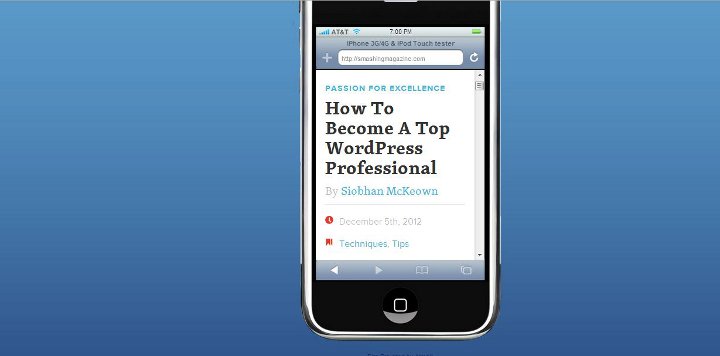
As the name suggests, this one of the most popular mobile emulators which is used for checking the compatibility of a website on the iPhones. All that you need to do is enter the URL of your website into the search box and get a real-time preview of how it would appear on an iPhone.
02. iPhoney
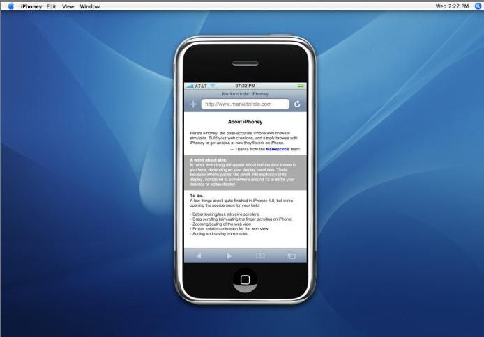
Another great tool for checking the compatibility of a website on iPhones, iPhoney isn’t only an emulator but allows you to create iPhone compatible websites. You can also test the images and codes along with all the functionality of the website in an iPhone environment using this tool.
03. Mobile Phone Emulator
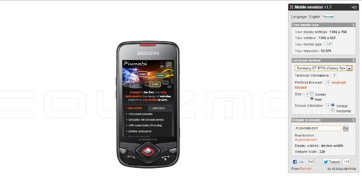
This surely one of the most popular mobile phone emulators that is being used by a large number of developers. The greatest advantage with this tool is that it tests the compatibility of the website across a large number of platforms including Samsung, iPhone, BlackBerry etc.
04. iPad Peek
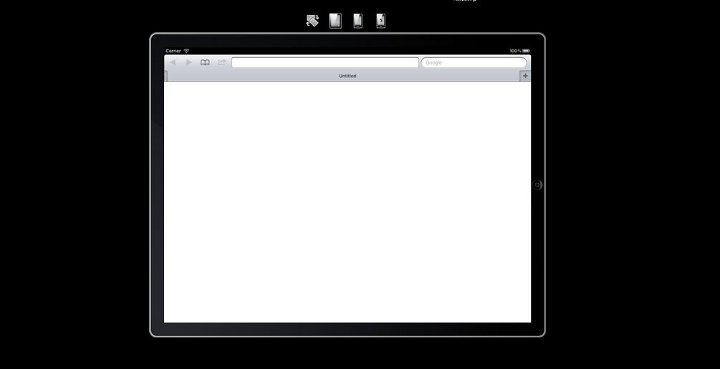
iPad is surely the most acclaimed tablet available in the market and to ensure that your website is compatible with iPads you can try out iPad Peek. It will replicate the appearance and functionality of your website on an iPad.
05. Gomez
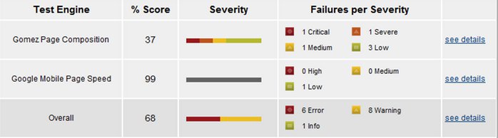
This doesn’t only check the compatibility of the website on mobile devices but also gives scores to help you judge its potential. It checks the mobile readiness of the website and assigns a score between 1 and 5 based on 30 different parameters including stylesheet use, media queries, caching techniques etc
06. Opera Mini Simulator
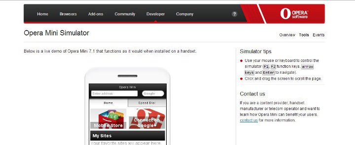
Opera Mini is surely one of the most popular mobile web browsers and thus it is important to check the compatibility of the website using Opera Mini Simulator. Using this you can take corrective measures on your website if any major errors exist.
07. Responsivepx
Responsive web design today needs no introduction and this tool helps is checking out the responsiveness/adaptability of the design of a website. You can choose between multiple screen sizes and check the appearance and the functionality of a website across different devices.
08. MobiReady
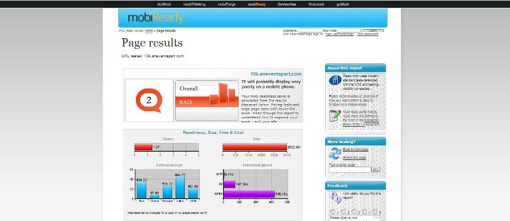
This works similar to Gomez and allows you to enter the URL of your website and test the website along different parameters including Page Test, Markup Test and Site Test. What makes it even more powerful than Gomez is the fact that it checks many other parameters such as dotMobi compliance and W3C mobile compliance, offering detailed error reports. It also has a comprehensive code checker which comes in handy.
09. Screenfly
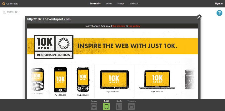
This one of the best preview tools as it allows you to see how the website would be rendered by a number of mobile devices apart from the traditional desktops and laptops. You can customize it the way you would like to test your website under various categories. This a must have emulation tool due to its wide coverage of platforms.
10. ProtoFluid
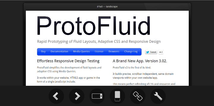
Similar to Screenfly, this tool is a greay way to test many different resolutions to cover some of the less common devices. It has a terrific UI, but isn’t 100% free, since you will need to buy a £5 license to use it more than 10 times. Still, it’s an excellent deal for a solid and very helpful tool.
Most of he aforementioned phone emulators come absolutely free and it is extremely easy to test your website using these. Remember the future is mobile and under no circumstance can you afford to miss out on any of the smartphone platforms when it comes to building a website which reaches out to all your targeted customers.