Attention to detail is the best policy for making great designs. It’s fairly easy to get a basic CSS layout up and running, whether you code it yourself or borrow it from a blank template site. For anyone who’s tried to make a great design, though, they can easily tell that making the design truly great is the hardest part. If you find yourself always displeased with your finished result, perhaps the problem is that you shouldn’t actually be finished.
Here are 5 extra things to keep in mind, to make any design more creative. Think of these 5 elements as sort of a checklist before you officially publish any sort of design.
1. The Background(s)
While simplicity is often in favor, there is a key difference between looking sleek and just plain boring. You don’t need to have a background pattern only on the background of your website. Keep open to other options, such as adding a background texture to a navigation area, or a background in the corner of the content block.
Here are some specific examples:
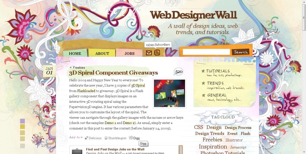
I use Nick’s blog a lot when referencing good design, because I believe he is an excellent designer to aspire too. As you can see, his main focus of the design is obviously is main background, the hand-drawn floral pattern. You can also see as well, that he’s added a lot of other backgrounds to elements like the header, tag cloud, and main navigation (tutorials, trends, and general). He’s even added a lighter flower pattern in the corner of the main wrapper, and a staple image to create a realistic detail.
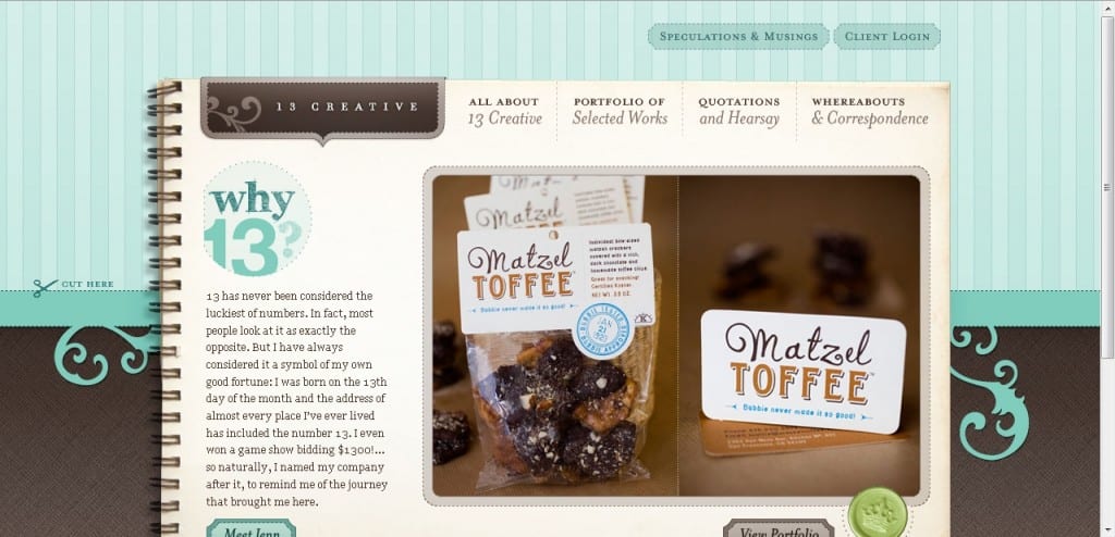
The idea behind 13Creative is to have a notebook for the background of the content, as if all the media of the website were written in a neatly organized booklet. As you can see, though, there is another decorative main background, with two separate sections as well. Along with the two main background ideas, 13Creative paid attention to the backgrounds of footer content, and with the two headings above the notebook background.
Spicing up a background doesn’t always mean textures and pictures though. Sometimes a balance between too plain and too complex is a simple gradient, or a lighted area effect.
2. Borders
Most people don’t mess with borders because it sometimes requires too much work for what they feel actually comes out of it. It is, however, one of the best methods for adding simplistic detail to any design.
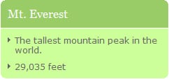
The image on the left is a simple use of a rounded border, with two different shades of green. Even though this example is simple, it’s creative enough to make it stand out.
Add special borders around content areas, headers, footers, etc. You can have the basic rounded curve, make it dotted, thick, thin, or add an image border.
Rounded corners, or corners with any specific shape are very popular, and there are various tutorials on how to do it. Explore these tutorials or find some on your own to find the technique best suited for you:
- http://www.schillmania.com/content/entries/2006/04/more-rounded-corners
- http://www.cssjuice.com/25-rounded-corners-techniques-with-css
Remember to be creative with the corners, but also keep in mind that it is a part of the design, and can be over-done.
3. Image Details & Icons
Line breaks, blockquotes, feed icons, and more: All great ways to add some visual appeal to a clean design. Small details like this can keep a layout user-friendly and sleek, while at the same time adding enough pizazz to make the design professional and nice to look at.
Popular WordPress themes have a knack for doing this, so I’ve showcased two of them. Blog designs also have a lot of opportunity for adding icons and details because they work in a loop, and contain so many different elements that are in need of organization.
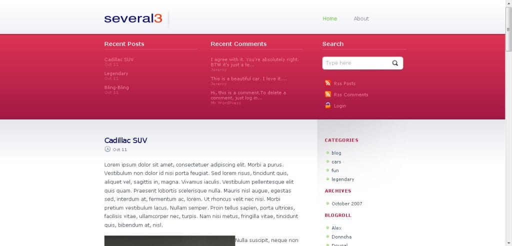
The designer of this theme only used a few colors, and a fairly basic CSS template. They did however, make a very appealing design, and some of this thanks to the small icons they used throughout the design. Notice the image bullets, the RSS and post icons in the header, and the icons next to the tags and comments at the end of each post. They’ve even used an icon in the background of the search bar for a bit more detail. From this example, you can see that even the tiniest of details to a design can add a lot to it.
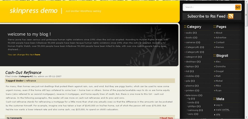
You can see from this example that the designer put most of the small details in the navigation area for the bullets. Taking the time to create small images for something as simple as a <ul> list property can make a world of difference. They also added some style to the navigation headers, and again to the RSS and search bar. They’ve also styled the blockquotes, as you can see if you scroll down.
When thinking of ways to add visual details to a design, keep these elements in mind:
- Blockquotes
- RSS/RSS2/ATOM Feeds
- <hr> line breaks
- Icons for blog tags, comments, categories
- Bullets and ordered lists
- Header tags (<h1>, <h2>, etc.)
There are other elements to a design that deserve image details, and it just takes some observant eyes to see them.
4. Creative Navigation
Navigation is a tricky concept because it has to be usable, but it should also have an original touch if you plan to make a creative design. Some websites seem to use their navigation as the main part of the design, which can create an amazing effect. For others, the navigation is simply worked into the layout with images, color, and interesting typography.
If you want to make your navigation more interesting, or even the main focus of your design, here are a few tips to follow.
- Usability is the most important aspect. Don’t forget about it at any point when designing the navigation element.
- For really noticeable navigation, use images, and animation effects, like rollovers. (Even if you only achieve these effects with CSS)
- It’s a good idea to keep navigation categories, such as the basic navigation (Home, About, Site, etc.) and the content navigation (Articles, Tutorials, Blog, etc.).
- Sometimes just adding a change in style can do wonders. For example, with a rollover effect, don’t just change the image to a darker version of the same image. Change the color, shape, border, etc.
- Be careful where you place the navigation. It should be to the side or on top, a usual place for navigation menus. This one aspect where you should never too creative.
5. Footers
It amazes me how many designers overlook the power of footers. The worst is when footers are simply ‘just the end of the content’. They don’t have any definitive end, border, style, or well…anything. Even in the simplest footers, there should be a separation between the end of the content and the beginning of the footer.

Here are two showcases of amazing footers. Some are very basic, as they just hold footer information such as contact, Privacy Policy, validation links, and copyright information. Others though, hold more information that can lead the visitor to other pages or features.
- http://www.justskins.com/design/28-web-design-with-creative-footer/1103
- http://www.smileycat.com/design_elements/footers
While not as common as Photoshop tutorials, there are plenty of footer tutorials and tips floating around the web. Most people overlook them, but it is well worth any designers time to learn new techniques for designing footers.
- http://www.alistapart.com/articles/footers
- http://fortysevenmedia.com/blog/archives/making_your_footer_stay_put_with_css
- http://ryanfait.com/resources/footer-stick-to-bottom-of-page
- http://www.thinkvitamin.com/features/css/bye-bye-to-boring-page-footers
- http://psdtuts.com/interface-tutorials/how-to-create-a-simple-sleek-web-20-site-footer
Conclusion
These are the main things to consider when trying to make any design more interesting.
Of course, everybody has a special trick to making designs pop. Do you have any specific tricks concerning any of these features, or better yet, any more techniques in general?

