At the end of the day, all of your SEO efforts are for one goal: to sell a product or service.
While every aspect of your site is designed for a great customer experience, there’s one page which is arguably more important than all the others: the pricing page.
You can do everything else right. Spread awareness of your brand across social media. Develop expert customer profiles and tailor-made conversion funnels. Connect with your customers on a personal level. But if your pricing page is poorly designed, customers won’t feel comfortable making a purchase.
Here are four ways to make your pricing page appealing to potential customers:

1. Coordinate Colors
Colors evoke emotion. Using the right combination of colors on your site can influence customer behavior. Major brands take brand color very seriously and so should you.
A powerful combination of logo and color can dramatically increase your brand recognition. Think of Target’s red bulls-eye, Amazon’s yellow “Add to Cart” button and others.
Keep you color scheme, logo, font and all-around style consistent across all your messaging. Not just on your main site but your social media pages, emails and – of course – your pricing page.
When people first see your pricing page, they should feel a sense of instant familiarity. After all, your page looks exactly like all the other content related to your brand. This helps convey a sense of trust.
2. Size each Element Appropriately
So, as we just established, you should be using the same font across all your content. You want to alter the size of font throughout the text.
Basically, you want to make the more important parts bigger and the least important parts smaller.
Bump up the font size for:
- Headlines
- Call-to-Action Buttons
- Pricing Plans
A pricing plan could be a specific product, bundle of services, subscription plan or other items for sale. You don’t need to highlight the price specifically, just use font size to showcase the products or services being sold.
Larger fonts make content seem more important. When users scan a page, they want to know the basic topic and what sort of products or services are available.

3. Use a Tiered Pricing Structure
Potential customers are more likely to make a purchase when they feel like they’re:
- getting a good deal
- have options to choose from
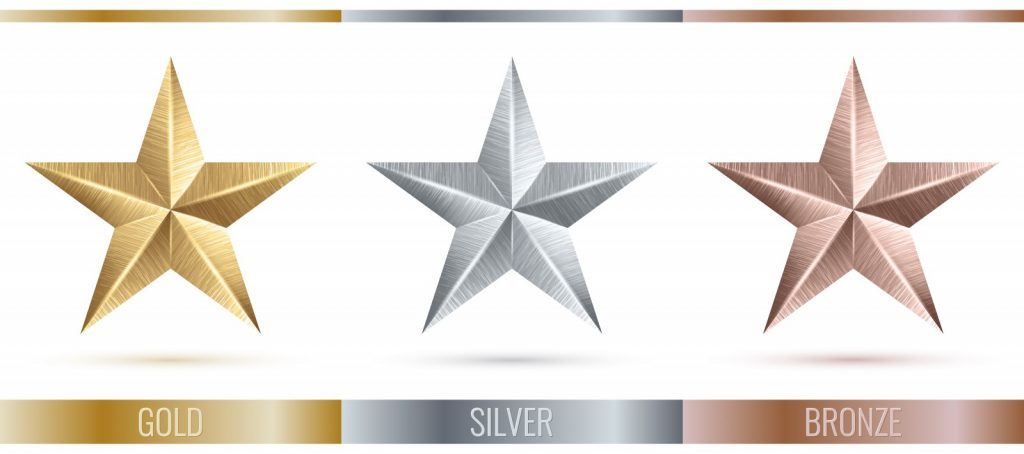
Most businesses find success by offering a three-tiered pricing structure. Typically, the tiers are broken down into:
- A low-cost option with only the essential services. No bonus features.
- A mid-range option with a few popular extra features.
- A high cost plan with all available features.
This pricing structure applies to a physical product, virtual service, subscription plan and basically anything else one can sell. Most customers will choose the mid-range option but listing at least two other options will often dramatically help increase sales.
4. Offer Limited Time Sales
Most people will always look for a reason to avoid making a purchase. You want to remove as much resistance as possible.
Limited Time sales encourage potential customers to take action quickly. If people think the current price or product isn’t always going to be available, they develop a great sense of urgency. This can lead people to make a purchase today which they’d normally put off until a later date.
Close that Sale!
Think of the price page as the last ten yards in a race. No matter how well you performed up until those last ten yards, the race is still won or lost by what you do as you close in on the finish line.
You want to set yourself up for success. When your potential customer arrives at the Pricing Page, you want to reinforce their trust and comfort in your brand.
You can appeal to your potential customers by creating a uniform look to your brand, emphasizing the important information and offering choices. Just a few simple changes can have a big effect on your conversion rates.


