Email remains important for marketers.
Consumers of all ages continue to use email. In fact, email is still required for most communication on the Internet. While social media messaging and broadcasting has become popular in recent years, email remains the biggest communication channel in the online world.
This means that companies still require the best email communication. It’s up to designers to create these emails and that can be a lot of pressure.
Here are 10 simple secrets for making email designs even better.
1. Lose The Jargon
Something everyone struggles with is jargon. When we’re working in a certain field we naturally start using terms nobody outside of our industry will understand. We use abbreviations and words that are like a foreign language to our friends and family.
Lose the jargon. Focus on words the customer uses. Customers don’t think about shoes that have a stacked wedge. They just want something that makes them look cool and stylish.
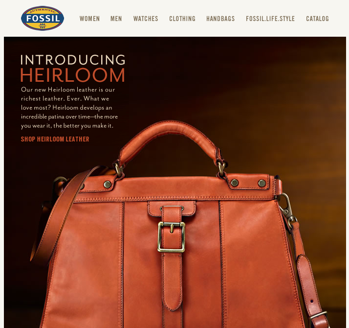
We’re to the point now where photographs are necessary in email design. People love looking at original photographs that are interesting. They want to see the items being used by people like them. Use photographs in your emails as much as you can. This adds more interest to the email design even more than a custom graphic.
2. Type Matters Just as Much as Graphics
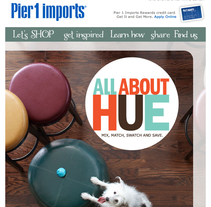
While we’re on the topic of content let’s discuss types and fonts. These elements are just as important as any graphic you create for an email. Customers notice the type in emails. It’s what they’re reading. Don’t use a variety of different types in email design if they don’t complement each other. Use types that are easy to read yet share a similar personality as the brand.
3. Photographs Are Necessary
4. Load Time Could Be Most Important
The time it takes for an email to load has always been important and it remains the most important element of email marketing. Don’t make your email files huge. Make sure people can see all the images quickly when they open the email on their desktop or on their phone. People don’t have time to wait for an email to load. They’ll move on to the next email in their inbox.
5. It’s About You, Not the Customer
One thing I see in the business world is that it’s all about the customer. While this true in some context I think it’s wrong in quite a few instances. A business needs to think about the business first. There should be a goal with each email you send. Most of the time you’re introducing a new product to the customer base and you want them to take action. Focus on this goal when creating the email design. You aren’t focused on the customer you’re focused on the goal of the business.
6. People Say They Want Change, But They Want Consistency
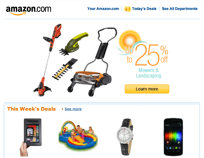
It always makes me laugh when people say they want change. I do think people want change, but when it comes to actually making the change it is difficult. For the most part people really want consistency. The tricky thing for a designer is to keep the overall look of an email design consistent so the customer isn’t thrown off. They want to be able to find things easy and get to the site fast. You can’t change too much too quick otherwise customer will freak out. Make little changes along the way so people can adapt.
7. Think Like a Landing Page
Building on the idea of a goal for the email is the idea of creating an email just as you would create a landing page. With landing pages there is always the goal of conversion. It could be to get a visitor to make a purchase or to sign up for something or to call the company. Think of your email designs like you would a landing page. This provides extreme focus that eliminates unnecessary elements.
8. It’s a Finger Clicking World
Mobile is perhaps the biggest trend for the Web. People are using their phones to access emails. Consider this trend when creating your emails. It’s almost more important to design for the mobile experience than it is for the desktop experience. Make sure the links and buttons and calls to action can happen on a phone. Get rid of those small links that are close to each other. They’re impossible to click with a finger.
9. Basic Color Rules Apply

Remember to use color correctly. Contrasting remains important in email design. This one of the first things designers learn, but it can be overlooked in email. If you want a person to take an action make sure the colors you use don’t hide the call to action.
10. Re-Purpose Content
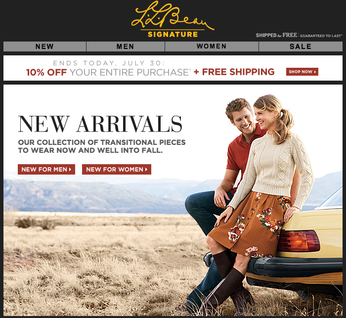
Earlier we mentioned using photographs. This difficult for some brands because they think they need to invest in photography specifically for the email program. This not true. One great thing about keeping things consistent is re-purposing content. Use photographs from anywhere in the business. Use catalog photography if it exists. Use photography from anywhere in the business. By re-purposing content of all kinds you’ll save time and money and it still makes for great emails.
Email marketing remains important for businesses and designers. There is demand for quality email design as businesses of all kinds look to earn the attention of their target customer while getting them to make purchases.
If you can become one of the best at email design there will demand for your services today and in the future. Hopefully these 10 tips will help you with your email designs.
And if you have anything to add please do. Help the other designers out there with your experience.

