Have you ever thought about what a huge impact a blog’s design has on its perception by readers? If you’re going to run a blog as a business (or part of your business), branding should be one of your biggest considerations.
And if you’re going to pull off a successful branding job, design is essential. Having a clean, reader-friendly design that is structured to accomplish your goals is, next to having excellent content, one of the best things you can do to help your blog succeed. Let’s look at 15 secrets that will help your next blog design stand out and be successful.
1. Go for the Logo
It’s worth repeating – a blog needs good branding as much as any other business, and the logo is obviously the first place to start! It’s important to really take some time and thought in this area to come up with something that’s not just good but excellent. Go for a design that is simple, classy (not trendy) and memorable. Here’s some good reading on this topic:
- What Makes a Good Logo?
- 5 Branding Basics Every Designer Should Know
- 12 Essential Rules to Follow When Designing a Logo
- Design a Logo – The Ultimate Guide
Your logo will be the ‘face’ of your blog, so make it unique and worth looking at!
2. But Don’t Leave it at That

Of course, your branding efforts and steps toward uniqueness shouldn’t stop with the logo! If you’re serious about creating a successful blog, you’ve got to come up with a creative theme as well.
One of the best areas to invest your creative theming efforts in is the background. Think Webdesigner Depot and Web Designer Wall. Those blogs are instantly recognizable, and very much talked about, because of their unique background illustrations.
Put some serious effort into creating an atmosphere with your theme – make it something that readers will feel good about coming back to.
3. Leverage That Favicon
![]()
Favicons seem so trivial, and yet what an impact they can have! Readers will seem them on tabs, next to bookmarks and in the address bar, so they will be seen quite a lot.You should definitely invest some thought in this one as well – keep it simple and similar in style to your logo.
Favicons are yet another way to improve your branding and create a unique identity for your blog, so don’t miss out on that opportunity.
4. Make it Easy to Subscribe
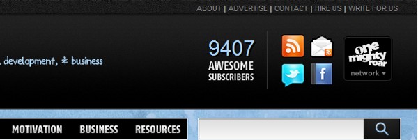
Since a strong subscription base is key to a successful blog, it stands to reason that you should do everything you can to promote your feed. Don’t shove it in people’s faces, but by all means make it easy for people who are interested to subscribe to your blog.
It drives me nuts when I want to subscribe to a blog and the rss is hidden way down in the sidebar or footer. Thankfully, that doesn’t happen often, but it’s still worth thinking about. People shouldn’t have to look for it!
5. Readability is Worth it’s Weight in Gold

The main point of a blog is text-based (unless you’re a podcaster or screencaster) content, right? People come to your blog to read! That means that good typography and readability is even more important than on other websites, if that’s possible.
Good readability has immense value for your blog, and should definitely be one of those high-priority areas that you put a lot of thought into. You can even get away with a crummy design if you have good readability (although I wouldn’t recommend it!). The point is that good readability is not just something you go over on your usability checklist – take the time to do it right.
6. Show a Personality

It’s been said before many times, but the advice still holds true as ever – show a person behind the site! The web is a personal place, and it makes such a difference when you can go to a blog and actually see the person/team behind it.
Have a good about page, show a picture, whatever it is that will let your personality shine through. You can incorporate this into your design by doing something like Viget Inspire’s author images or including a picture/friendly copy widget on the front page to introduce yourself and welcome visitors, like on Michael Dunlop’s IncomeDiary. Build some trust and loyalty with the community and it will go a long way.
7. Plan for Monetization
If you are running your blog to make a profit, be sure to plan ahead of time how you are going to monetize it. Sometimes ads just get slapped on as an afterthought, but your monetization will be much more effective, and pleasant, if you plan it out ahead of time.
Do you plan to use BuySellAds? Are you going to have Google AdSense on your blog? Affiliate marketing? E-book production? Whatever it is, think about how you’re going to incorporate that smoothly into your design. The blog will be more enjoyable and you’ll likely have better conversion as well.
8. Make Discussion a Priority, Not an Afterthought
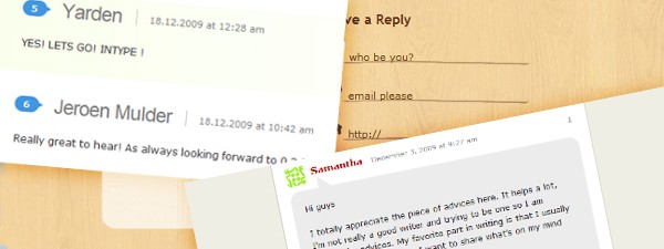
One of the most important signs of a healthy blog is an engaged, commenting community. When you’re first sketching out your wireframes, then, think about discussion and how you’re going to encourage it.
Come up with a really unique, impressive, comment and comment form design, and plan for having a recent comments or top commenters section in the footer or sidebar. By making discussion a priority rather than an afterthought you can help yourself develop that thriving community that every blogger longs to have.
9. Efficient Navigation is a Must
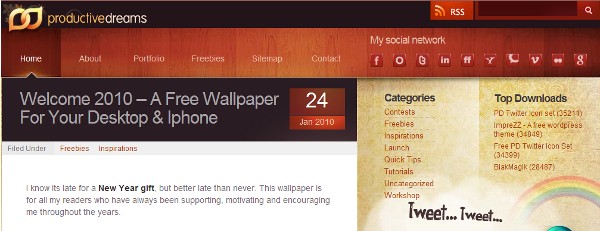
Readers should never have to work to find what they’re looking for on your blog – “Don’t Make Me Think” still holds true. That means you should have effective navigation, be it tag based, category based or some other way. It’s also helpful to design some nice looking secondary navigation to show things like popular posts or related posts (more on that below).
Making it easy to track down specific types of posts will make your readers happier and cause them to read things they wouldn’t have otherwise. That’s a pretty big payoff!
10. Ditto on an Easy to Find Searchbox

Some people tend to prefer the searchbox to a navigation system, and even those who use the navigation system might still want to find search if they’re having trouble finding something. That means that an easy-to-find search function is a must-have as well.
A lot of blogs have the search down in the sidebar, I personally prefer it about the fold, but it’s your decision. Just make sure it’s easy to track down and use!
11. Destroy the Bounce
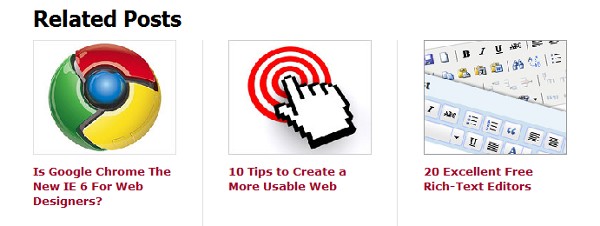
It’s a proven, time-tested tactic – once you have somebody looking at something, it’s way easier to channel that into looking at something else. That’s why so many blogs have a related posts section at the end of each post.
By building an appealing related post section into your blog, you can lower your bounce rate and help readers find more good information without making them search for it.
12. Awesomeize Your Footer

A good footer can be so much more than the end of the page. In fact, it can be one of the most valuable parts of the page, enabling you to take traffic that has “made it to the end” and redirect them back into the site.
There are two things that really make a footer stand out – impressive graphics and good content. Get those two and your design will be better for it, I ensure you. Here’s some good reading on how to get those two ingredients:
- Footers in Modern Web Design: Creative Example and Ideas
- Top Notch WordPress Footer Designs (Best Practices and Tips)
- 50 Excellent Blog Footer Designs
13. Give Some TLC to That Poor 404 Page
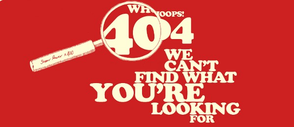
That 404’s happen is a fact of life – some one mistypes a link on their blog, you change your permalink structure, etc. What you do with them, however, is something entirely different. The basic “404 – Missing Page” is so common it can almost bring you to tears. What a disappointment to click on a link and see that.
The good news is, you can be different! Done right, 404 pages can be entertaining, trust-building, and even help someone find a part of your blog they might not have before. There have been plenty of inspirational collections of 404 pages that are done right:
- 60 Unique 404 Error Pages
- 50 Creative & Inspiring 404 Pages
- 404 Error Pages for Your Viewing Pleasure
- 404 Error Pages Reloaded
- 404 Error Pages One More Time
Try giving readers a way to reorient themselves, another chance to find what they’re looking for and hopefully even a way to find something new – it makes a big difference.
14. Do Something Cool with Post Images
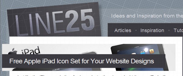
Post thumbnail images have clearly become a de facto standard of blog design. They are one of the most beneficial trends I can think of, and it’s amazing how much images can add to the polish of a blog’s presentation.
If you want to go for extra credit, you can even try something creative with the layout (other than the same old square image on the left). If you aren’t sure what I mean, check out how Chris Spooner did it on Line25. And some good news – WordPress 2.9 has an awesome new post-thumbnail feature that makes it easier than ever before!
15. When You Think You’re Done, You Aren’t

Nick La hit on the head in his interview in the Smashing Book: when asked how he knows when a design is complete he said,
“To me, a design is never complete. Even after the website is launched, I often find ways to enhance it based on feedback.”
Remember that – design is a process of continual enhancement and improvement. Don’t expect to be ‘done’ with a blog design, because it won’t be. Instead, enjoy the process of continually improving – and keep working to make your blog as effective as it can be.
Wrapping Up
The blogging market is huge, so whether you are designing your own blog or marketing yourself to others as a blog design specialist, having a good grasp of what makes a good blog design will have some huge rewards.
Hopefully you’ve enjoyed this and been inspired to change the way you go about blog design. Of course, it’s easier said than done (Webitect doesn’t quite measure up on all these, either), so if you have an experience to share or think of anything else that should be on this list, do tell in the comments!


