I often see webmasters who complain that they don’t have a ‘knack’ for the design element to creating websites. What most people don’t realize, though, is that design skills are a learned aspect for even the greatest designers. Nobody is born a great artist, whether their talents included an easel or a web design template.
In order to create good designs, especially in web design where functionality is so important, one needs to understand design principles. These include understanding color, size, contrast, shape, and what I’m going to be focusing on today, balance.
Why Balance Makes Websites Look Good
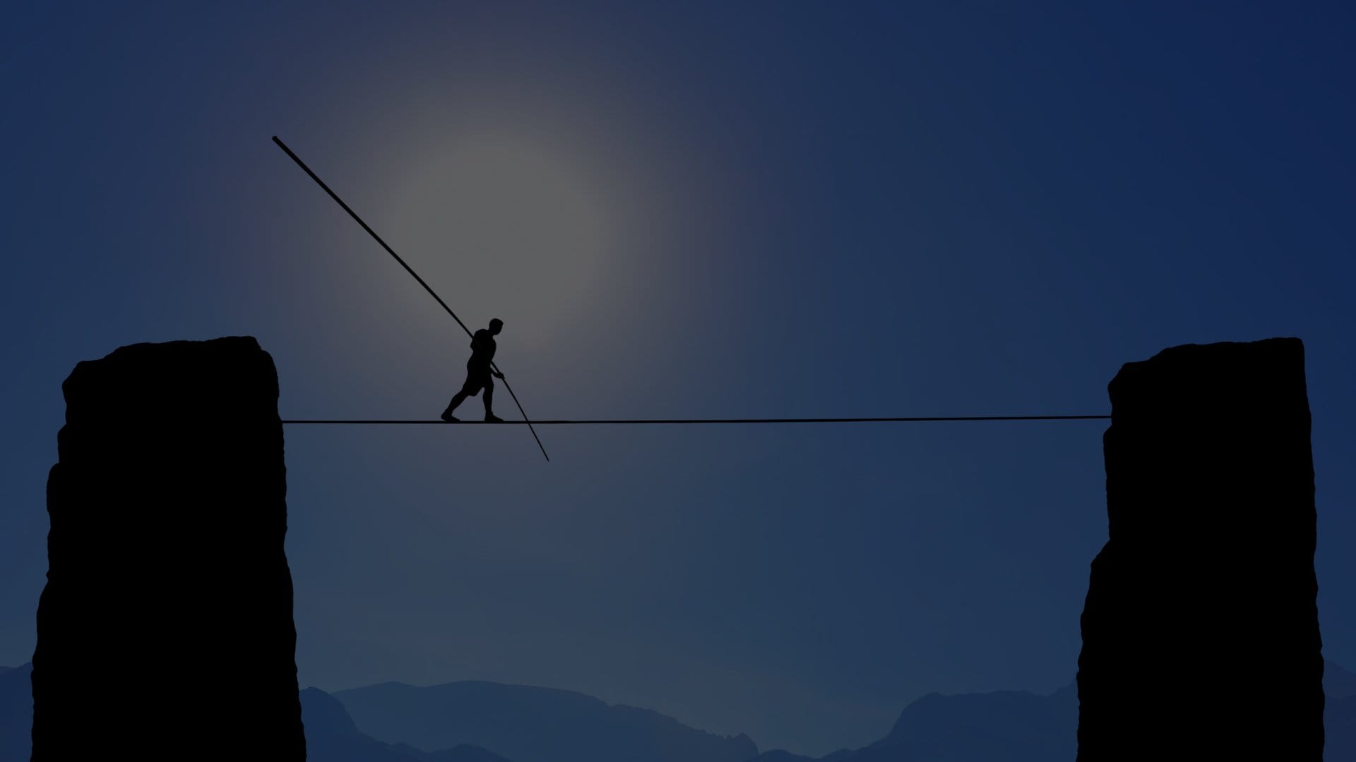
Our brain likes it. Because of natural forces (like gravity), our natural mind likes things that are even, and seem stable. Something that is the opposite, such as scattered and unorganized, gives us a subconscious tension.
Therefore, visual balance is a key element to making a website look good. It’s that extra ‘spark’ some designers seem to have and others don’t. As an added benefit, a balanced design goes well with functionality. We relate things to the natural world, and a natural balance will allow our eyes to see what we’re supposed to in an a design.
Types of Balance
There are three different types of balance: formal, informal, and radial. Formal and informal balance may also be called symmetrical and asymmetrical respectively.
Here is a website that goes over the different types of balance more in detail, with visual examples included:
- http://www.usask.ca/education/coursework/skaalid/theory/cgdt/balance.htm
- https://theguerrilla.agency/web-design
- https://theguerrilla.agency/web-design/minneapolis
Understanding these types of balance and how they relate to the design world can help you become a better web designer.
How to Include Balance on Your Site
So finally interested in integrating this into a design? The most basic balanced template is the centered layout. It obviously has a content area, and the white space on the two sides, which are even.
Just a content area is a bit plain and unusable. So now a navigation bar needs to be in place. If you look at an appealing layout, you’ll notice the navigation menu is probably darker than the content area. This because darker space is ‘heavier’ than lighter space, and a smaller navigation area is ‘lighter’ than a large content area. Therefore, the two balance each other out.
The first step is to plan a layout. Include your content, navigation areas, and keep your images in mind to. Use the concept above, and remember to keep your design balanced as you add more elements. Use the tips below when planning a layout.
- Bigger areas are heavier than smaller areas.
- Darker areas are heaver than lighter areas.
- Saturated colors are heavier than unsaturated colors.
- A stronger border is heavier than no border or a thin one.
- Texture is heavier than no texture. The denser the texture, the heavier.
- Don’t only worry about horizontal balance (Like a basic, centered layout). Also remember vertical and radial balance.
- Colors like red and orange are heavier than calm colors like blue or green.
Look at Examples
Sometimes it is easier to understand the use of balance in design with visual examples. Take a look at these websites that define the design principle better, and with a more visual appeal:
- http://www.digital-web.com/articles/principles_of_design
- http://desktoppub.about.com/od/designprinciples/l/aa_balance1.htm
Of course, any principle of design cannot be learned just like a math formula. Rather than a specific set of rules, design skills come from experience and a basic knowledge of the science we can make of it.
Obviously, design balance can be a lot more advanced than this, and it is indeed a lot about creativity. Do you have a creative way to find balance in a website layout? Are you using balance in your design at all?
I noticed I started using balance in my website layouts before I was even aware of it. It just comes naturally, sort of. By being aware of it, though, I became much more experienced and was able to control it consciously.