Web design is about more than just looking good. Rather, successful web design facilitates a smooth interaction between your organization and your users. Whether you’re selling a product, providing a service or doing something else entirely, the design of your site is a major element in your success.
Phil Singleton and his team will design a site for you which will look great, function seamlessly and create an overall pleasing experience for your users.
Phil’s Seven Guidelines for Successful Web Design:
1. Clean Design
Online, first impressions are very important. When a new user lands on any page of your site, they want to instantly understand what you’re all about. A website with a clean design is one where the information is organized and the page uncluttered. Each page is either devoted to a single topic or is a clear list of multiple topics.
Additionally, clean design means every page will have an easy way for visitors to either order something or otherwise contact you.
2. Appropriate Typography
When it comes to text, the general rule is readability trumps appearance. This doesn’t mean the text can’t look good. Rather, the content must be published in an easy-to-read font and in a solid color which contrasts against the background.
Additionally, paragraphs should be short, generally no more than a few sentences. Text usually reads best when it’s left justified, instead of full justification. Also, line limits should be reasonable. Users should never have to scroll horizontally in order to read the text.
3. Perfect Padding
This the space between text and the other elements on the page, such as photographs or graphics. Barring specific design choices, the general rule is there should be enough padding to create a pleasant appearance. Too little padding and readability is affected. Too much and the elements on the site appears disconnected.
4. Plenty of White Space
Web site design should always incorporate a lot of space. When too much information is placed on a page, users often become confused. Rather, sites should be easy to understand at a glance, and even complicated information should be presented in an organized manner.
5. Easy Usability
Your site should be easy to navigate. Predictability is key here. Users expect certain features from websites. For instance, all underlined words should be a link, a contact form should be accessible from every page and so on.
Thisn’t to say that your site needs to look dull and generic. Rather, it’s about understanding what features people expect to find on your page, and then giving them those features. The easier your site is to navigate, the longer your users are going to stay. The longer they stay, the more likely they are to take action.
6. Multi-platform Functionality
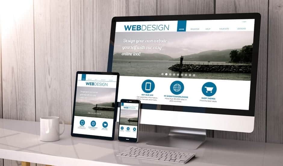
Not everybody will view your site on the same type of device, so your design should work on multiple platforms. Your site should be not just designed for desktops, but also for tablets, smartphones and other mobile platforms. Each type of device has different design needs. Your site needs both a professional look and excellent functionality on whatever platform your user chooses.
7. Visual Aids
Successful web design incorporates pictures, photographs and often video. Even something as simple as pictures of your staff help creates credibility and trust. Additionally, some users will prefer to learn about your business by watching a video, instead of reading.
For best results, graphics and video should be professional quality, created by experts. Also, placement is very important. Graphics shouldn’t interfere with text and vice versa. The video should be easy to find for users who want it, but easy to avoid for users who don’t. For example, almost everybody dislikes loud, auto-playing videos.
How The Guerrilla Team Work to Design Your Site
Different types of businesses call for different types of design. First, Phil and his team gather information. They’ll research your company specifically, your industry generally, the target demographics you’re trying to reach and any existing branding and logos you may have. These factors are used to create a site which will drive visitors to whatever goal you have in mind — be it making a purchase, contacting you directly or anything else. Your site will also be fully integrated with your social media platforms.
Once your site is completed, you’ll be able to manage it easily through a simple interface, which you’ll be taught how to use. You’ll learn how quickly add new pages as well as change the content on existing ones. Of course, Phil and his team are available whenever you might need them. They can even help you with hosting, which is often one of the more frustrating aspects of running a website.
The Guerrilla’s Conclusion:
Great design is often invisible to the user, while a poorly designed site is almost instantly noticed. Great design is when a user comes to your site and instantly understands what your business is all about. They’re able to find the information they want in seconds, and they’re able to contact you quickly both by phone or email. On the other hand, a poorly designed site will leave users feeling overwhelmed with information, and without a clear ‘road map’ to find the information they seek.
We understand the universal concepts of web design which create a satisfying experience for the user. We’re also able to design a site that will appeal to your target audience, is appropriate for your industry, and matches your company’s existing brand image. We also make it easy to add additional pages to your site as your needs change in the future. With over a decade of experience, my team and I know what it takes to make you look your best. Call today or send us an email – we’re ready to help.


