Creative designers never cease to amaze. We often ask ourselves, “Why couldn’t I think of that?” The trick is, these designers never says that to themselves. Instead, they’re busy thinking about their own talents and unique behavior.
If you’d really like to make a new design that is finally original, take these 10 ways of thinking into consideration.
1. Think Opposite
If you see a lot of something in web design, turn it upside down. Invert colors, change direction, misplace it in a new setting, or think of an interesting perspective. Here are three designs that do just that.
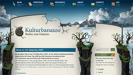
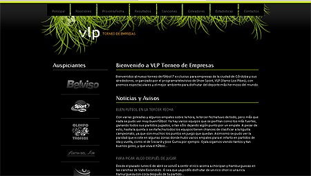
Find more examples in 17 Web Designs with Interesting Perspective.
2. Think Bold and Over Exaggerated
Create a huge logo, extra whitespace, or an oddly placed content area. The idea is to turn a small “interesting” idea, into an over-exaggerated, amazing idea.
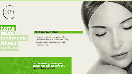
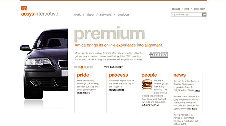
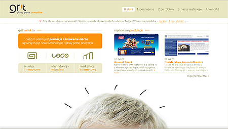
All three of these feature a large central image, and interesting spacing of content. Think about how the designer had to go through a process considering usability, hierarchy, and visual elements to make their over exaggerated idea a reality.
3. Think of the Overall Theme
What overall theme are you going for? Instead of claiming something like ‘Grunge’, ‘Sleek’, ‘Artsy’, etc., have an actual theme– Under the sea, your favorite sport, cityscape, or nature.
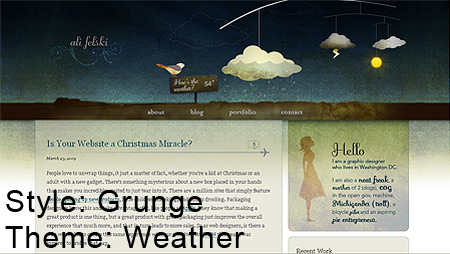
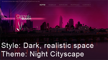
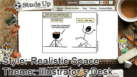
All three of these designs stick out because they’re representing something more than the thousands of other sites doing the same styles repeatedly.
4. Think of the Details
Once you have a theme, start designing your own unique details. These could be images or features in the visual aspect of the design, or smaller details, like borders, backgrounds and textures.
Adding a little something extra can add a lot to the entire visual appeal of a design. Notice above how some of these examples are simple extra shapes in the design, while others are background textures or shapes for headers, search bars, and navigation.
5. Think Typography
The font, size, and style should still all be legible and theme-appropriate, but think of different ways to incorporate typography into your design. A List Apart is known for it’s interesting typography, even in such a simple design. A blend of text style, size, and fonts make the overall website appealing.
Here are some ideas to add extra typographic elements in a design:
- Create an amazing typography-based logo, and make it the main focus.
- Create image headers, labels, and other forms of permanent text with interesting fonts and text effects.
- Make typography really big, really small, or really interesting and place it somewhere on the page.
- Go crazy with the navigation, but don’t make it confusing. Extra big, an interesting font, or a unique location can all add interest.
6. Think of Space and Layout
Create a twist on the basic header-content-sidebar-footer layout. Do do this, plan out the goals for the design first:
- Do you want visitors to notice your content first? Navigation? Logo?
- How do you want your visitors to feel about your design?
- How usable does your design need to be? You may need some sense of a generic layout.
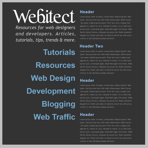
Next, enhance on these answers. If you want a specific image to stand out, think of where to place it very carefully. The top left is where the visitors eyes go first, so try to place the main feature in this area.
Don’t default this to the very top left, though. That can get boring.To help, divide your screen into four sections, and put the image anywhere in the top left section.
When you’ve found a suitable place for the main feature, whether it be a logo, image, navigation, or content, create the rest of the design around it.
The typography design featured in the Typography Web Design Tutorial provides a unique layout structure. Two columns, with a header and navigation in one, and all of the content in the other. This makes the design interesting, even if it only contains text.
7. Think of Personal Techniques
Everyone has their own library of personal techniques, whether we know it or not. Take some time to think about and analyze your own techniques and design habits that you’ve picked up over the years.
To determine your own techniques, consider the following:
- Do you have a general color scheme you tend to?
- Do you have any tutorial you picked up on years ago, but have probably tweaked significantly since?
- What type of layout do you usually go for? Why does it work, and why doesn’t it?
- Do you usually use brushes, images, color, or typography as a main design focus?
Take out a piece of paper and answer these questions. Then, create a list under each as to how you could improve or define your technique to make it more your own.
8. Think of Reasons Why Your Favorite Site Sucks
Take out another piece of paper, and write down at least 10 reasons why your favorite site sucks. You’ve admired it for so long, but what’s bad about it? These may be personal preferences or bigger issues like usability.
The list should include problems you notice with the following:
- Look at the overall design– layout, style, and general appeal.
- Notice colors, shapes, and other details in the design.
- What is it’s usability rating?
- Is the site well optimized for widespread usability and ads?
- Look at the hierarchy– do your eyes get lead to where they need to be?
- What content is this site offers? Is it working for a large audience in its niche?
After considering these 10 reasons, write out, in detail, how you would take action to make it better. Then apply similar techniques to your own design.
9. Think of the Most Interesting Object you can Find
Do you find interest in the vintage appeal of an old pocket watch? Or is the newest gadget on the market your fancy? For whatever reason, we find certain objects and ideas appealing, and that fascination is unique to us. Think of your favorite animal, season, or era and expand a design idea upon it.
10. Think of Your Favorite Design Style
Now you can think of sleek, grunge, or hand-drawn styles. This time though, don’t think of ways to copy it. Just look at the core features of the design that most interests you, and work with those details. For example, if you like grunge style, work with your unique tastes while using grunge colors, texture, and detail.
Implement the 10 reasons above, and use the core components of your favorite design style to create a fabulous design.


