1. Create 5 PSD’s, and Ask for a Review
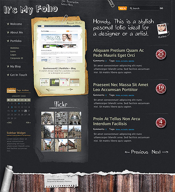
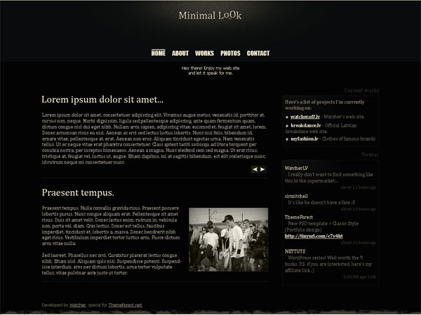
Create some completed mockups in Photoshop, and go onto forums to ask for a review. Many nice forum goers (and unfortunately sometimes snobby as well) will be glad to give you some feedback. Take both the positive and negative feedback, and reflect upon it to create better compositions in the future. Some reviews may even be specific enough to let a designer know what elements of design he/she is lacking in, so the faults may be studied in further detail.
In the title of this first technique, it says to create five PSD templates. Try to create five different PSD’S from five different design styles. For example, one of each of the following could be done:
Modern/Sleek

Grunge
Hand-Drawn
Light on Dark Text
Typography Only
One could also try out new techniques and get feedback on those.
By doing different types of styles, a designer can gain more experience, and see where he or she excels. The designer may also notice a weak point that they would gladly like to build upon. Perhaps through review you find a style that you’re better at — build your portfolio around that style. In addition, focus on improving with other styles to accommodate different clients’ needs.
2. Study Design Principles
Many new designers don’t understand the importance of basic design principles. Graphic designers and other forms of designers that actually attend higher education for this learn design principles first. Below is the copy from Digital Web Magazine of the overview of basic design principles.
Balance
Balance is an equilibrium that results from looking at images and judging them against our ideas of physical structure (such as mass, gravity or the sides of a page). It is the arrangement of the objects in a given design as it relates to their visual weight within a composition. Balance usually comes in two forms: symmetrical and asymmetrical.
Symmetrical
Symmetrical balance occurs when the weight of a composition is evenly distributed around a central vertical or horizontal axis. Under normal circumstances it assumes identical forms on both sides of the axis. When symmetry occurs with similar, but not identical, forms it is called approximate symmetry. In addition, it is possible to build a composition equally around a central point resulting in radial symmetry1. Symmetrical balance is also known as formal balance.
Asymmetrical
Asymmetrical balance occurs when the weight of a composition is not evenly distributed around a central axis. It involves the arranging of objects of differing size in a composition such that they balance one another with their respective visual weights. Often there is one dominant form that is offset by many smaller forms. In general, asymmetrical compositions tend to have a greater sense of visual tension. Asymmetrical balance is also known as informal balance.
Horizontal
symmetryApproximate
horizontal symmetryRadial
symmetryAsymmetryRhythm
Rhythm is the repetition or alternation of elements, often with defined intervals between them. Rhythm can create a sense of movement, and can establish pattern and texture. There are many different kinds of rhythm, often defined by the feeling it evokes when looking at it.
- Regular: A regular rhythm occurs when the intervals between the elements, and often the elements themselves, are similar in size or length.
- Flowing: A flowing rhythm gives a sense of movement, and is often more organic in nature.
- Progressive: A progressive rhythm shows a sequence of forms through a progression of steps.
Regular
rhythmFlowing
rhythmProgressive
rhythmProportion
Proportion is the comparison of dimensions or distribution of forms. It is the relationship in scale between one element and another, or between a whole object and one of its parts. Differing proportions within a composition can relate to different kinds of balance or symmetry, and can help establish visual weight and depth. In the below examples, notice how the smaller elements seem to recede into the background while the larger elements come to the front.
Dominance
Dominance relates to varying degrees of emphasis in design. It determines the visual weight of a composition, establishes space and perspective, and often resolves where the eye goes first when looking at a design. There are three stages of dominance, each relating to the weight of a particular object within a composition.
- Dominant: The object given the most visual weight, the element of primary emphasis that advances to the foreground in the composition.
- Sub-dominant: The element of secondary emphasis, the elements in the middle ground of the composition.
- Subordinate: The object given the least visual weight, the element of tertiary emphasis that recedes to the background of the composition.
In the below example, the trees act as the dominant element, the house and hills as the secondary element, and the mountains as the tertiary element.
Unity
The concept of unity describes the relationship between the individual parts and the whole of a composition. It investigates the aspects of a given design that are necessary to tie the composition together, to give it a sense of wholeness, or to break it apart and give it a sense of variety. Unity in design is a concept that stems from some of the Gestalt theories of visual perception and psychology, specifically those dealing with how the human brain organizes visual information into categories, or groups2.
Gestalt theory itself is rather lengthy and complex, dealing in various levels of abstraction and generalization, but some of the basic ideas that come out of this kind of thinking are more universal.
Closure
Closure is the idea that the brain tends to fill in missing information when it perceives an object is missing some of its pieces. Objects can be deconstructed into groups of smaller parts, and when some of these parts are missing the brain tends to add information about an object to achieve closure. In the below examples, we compulsively fill in the missing information to create shape.
Continuance
Continuance is the idea that once you begin looking in one direction, you will continue to do so until something more significant catches your attention. Perspective, or the use of dominant directional lines, tends to successfully direct the viewers eye in a given direction. In addition, the eye direction of any subjects in the design itself can cause a similar effect. In the below example, the eye immediately goes down the direction of the road ending up in the upper right corner of the frame of reference. There is no other dominant object to catch and redirect the attention.
Similarity, Proximity and Alignment
Items of similar size, shape and color tend to be grouped together by the brain, and a semantic relationship between the items is formed. In addition, items in close proximity to or aligned with one another tend to be grouped in a similar way. In the below example, notice how much easier it is to group and define the shape of the objects in the upper left than the lower right.
Head on over to the Principles of Design to read more. Even if you’ve been a designer for years, reread through these and perhaps even more advanced design principles (like Divine Proportion) to become a better designer.
3. Do a Design Tutorial
Sometimes just running through a tutorial on the web can open your eyes to many new techniques, best practices, and even put the design principles above in action to better see how they can work. Also, focus on actual graphic design tutorials specifically to become better at design.
Things you may want to consider learning about are:
- Logo Design
- Illustrator Vector Art
- Graphic Design Photoshop Tutorials
- Image Manipulation
There are plenty of websites that focus more on graphic design rather than web design tutorials. Branch out and stop learning how to create different types of web designs. Focus on the design aspect so you can later implement it into a web design.
4. Collect Resources
Go browse the net now and find your favorite blogs, resource sites, and inspirational sites. Subscribe to all of their feeds. I found that before I did this, I only had a few feeds, and not a lot of inspiration. Get familiar with the community by staying up to date. Right now, I have 15+ feeds in my Google reader right now, meaning I have 42 (15×3) possible sources of inspiration or knowledge-gaining just on my Google page.
By doing this, you can find inspiration, a great new tutorial, or expand your horizons beyond just what you’re looking for. It may help you discover something in the design world you weren’t even aware of. Without a collection of resources like this, you are limited to only building upon what you already know.

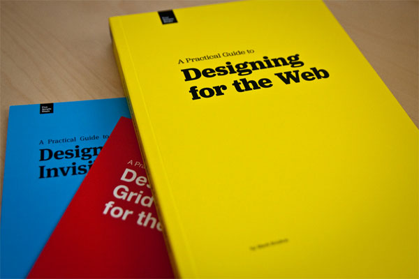
Also (with the right finances) collect design books, help sheets, and other forms of printed materials. Inspiration beyond the computer screen is invaluable as many designers know, and sometimes we can think and learn with a clearer head from a book rather than a computer screen. Also, many design-related books, magazines, and other materials are much more in-depth than the average blog post or article on the web.
5. Find Your Worst Habits
What are your worst habits as far as graphic design goes? Is it not branching out into new tangents? Is it not using enough whitespace and cluttering up your designs? Is it a lack in creativity?
Once you identify your bad designer habits, you can focus on fixing them. If you determine you have a problem with creativity, research methods on how to become creative in your own sense. If it’s a more specific issue — like the cluttering of a design and lack of whitespace issue above — research whitespace and techniques on becoming better at identifying a great use of it.
You may find that focusing very specifically on your problems can help you better overcome them rather than trying to learn new design techniques from all over the place.


