Search engine optimization is the foundation for building your brand online. But all the brand awareness, social media shares and audience engagement in the world doesn’t matter if you’re not making sales.
The most important metric for your website is your CRO, which stands for Conversion Rate Optimization. New to the world of CRO? No problem! Here’s what you need to know:
What is Conversion Rate Optimization?
A conversion is when a potential customer responds to your call-to-action. Some common examples of a conversion are:
- Opening an email sent from your brand
- Clicking a link inside an email or within a social media post
- Filling out a form on a landing page to request more information
All of these actions are part of the Conversion Funnel, which hopefully leads to the ultimate conversion: a sale.
Some conversions are simple. An example would be a customer who finds a coupon and uses it to make a purchase.
Other conversions have a longer path. B2B sales typically only occur after a series of smaller conversions such as signing up for a newsletter, engaging on social media and similar.
The Importance of Calls to Action
Conversions of all types depend on at least one successful Call to Action (CTA). Each brand’s Conversion Funnel is specific to their needs, but all customer journeys follow the same general path:
- The consumer is first introduced to your brand via direct advertising, social media, organic search, referral or in some other way.
- The consumer expresses some type of interest in your brand. This could be a social media follow, email sign-up or other request for more information.
- The customer then engages with additional information by clicking on a link in an email or taking a similar action
- At this point, your potential customer might be presented with a product for sale or with additional points on the conversion funnel. The details depend on your business operations.
Throughout the entire process from “never heard of your brand” to “loyal customer,” your CTA buttons are vital.
Do You Know Your Customers?
In order to be successful online, you need to research your potential audience. This includes creating a Customer Persona, which is a demographic representation of your target market.
Most SEO pros tailor all their marketing efforts, including their content, towards their Customer Persona. This the smart way to connect with your desired audience.
Unfortunately, many SEO pros don’t apply this same principle to their CTAs. I know because I used to be one of those pros. After all, a CTA is part of the design of the page. I figured my background in web design was all I needed.
Turns out, I was wrong. There’s a better way.
What’s the Best Design for a CTA Button?
When you’re designing your pages, what’s the best look for your call to action button? Are there certain words you can use which increase conversions? For instance, does the informal “gimme more info” convert better than “send me more info”?
The answer is a resounding yes and no. Here’s what I mean:
The best type of CTA is the one which your audience responds to.
Finding out what your customers like best isn’t a matter of guesswork. In most cases, it’s not even a matter of design. Instead, finding the perfect CTA is the result of split testing.
Split Testing Explained
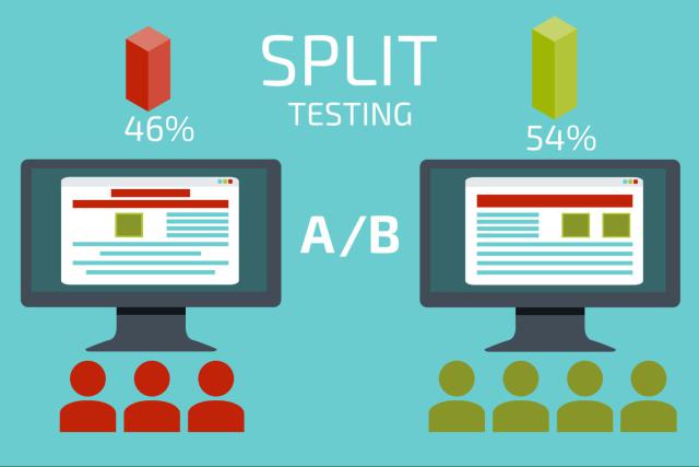
Split Testing is also often called A/B Testing. This when you:
- Create two different types of content
- Present them to two similar, but separate, audiences
- Measure the results
With split testing, you’re not relying on opinion polls or guesswork. You’re selecting what actually works with your audience.
Refining your CTAs with A/B testing increases conversions, sales and subscribers. You can conduct split tests for each stage of your conversion funnel.
Each refinement leads to a conversion increase. You’ll notice the benefits relatively quickly, too. We’re talking a matter of days and weeks instead of the months associated with SEO changes.
Preparing for the Split Test
First, you need a solid foundation. These are proven traits found on all successful websites. Be sure and include:
- Engaging, descriptive above-the-fold headlines
- Exactly one call-to-action per page. Make sure your CTA is visible and clear.
- Text which is broken up into easy-to-read sections. No “text walls.”
- Video, graphics and other media
When you stick with these standards, you reduce variables and can conduct more accurate A/B testing.

Conducting the A/B Test
Once your page has a solid foundation, you’re ready for your first A/B test. Here’s the number one rule: Only test one variable at a time. Otherwise you won’t be able to identify what’s working and what isn’t.
For your first A/B test, you’ll want to make changes to only one of the two splits. Leave page A as is, and make your alteration to page B.
You’ll want to measure performance for about a month. When you determine which change is better, you can then move onto additional testing. For the most part, especially initially, you’re not going to see massive differences. You can make decisions based on just 5% differences.
A/B Testing takes the guesswork out of your Call-to-Action planning.


