1. Add Gradients
Gradients can add a lot to web design without overpowering it. They also add depth and a modern appeal. Gradients can come in a variety of forms, too.
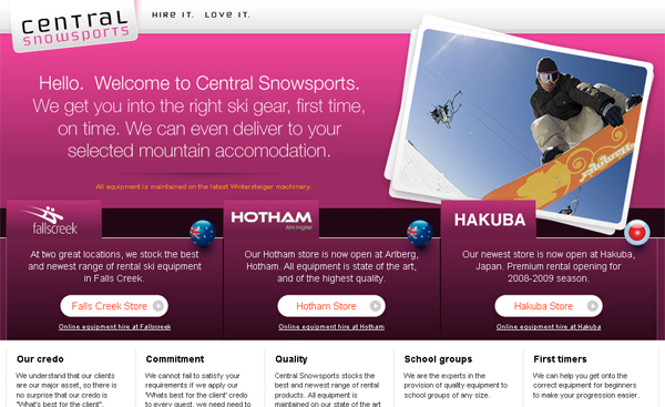
The example above uses gradients all over the place. From the top bar, to the logo, and throughout the various types of content. As you can see, there are different variations of gradient too. The gradients with the deepest contrast (Fallscreek, Hotham, and Hakuba) create a place for the eyes to focus.
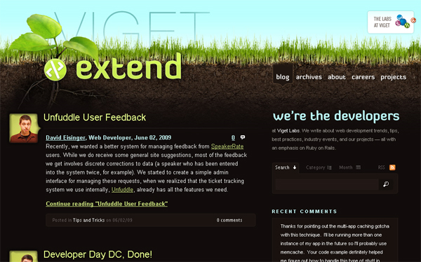
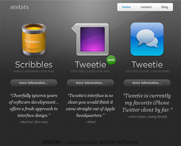
Gradients can be added very subtly too. The above design is far from a sleek style, but gradients are still present in the logo and site title, and in various icons throughout the design.
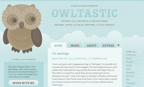
This illustrative design uses slight gradients throughout the illustration, and adds detail with gradients to the navigation and various icons.
2. Add Lighting Effects
A technique that is sometimes similar to gradients is lighting effects. Glowing, spotlight, or other lighting effects can have a significant impact on the overall design. Again, lighting effects add depth and visual appeal, but with a bit more pizazz. These effects are oftentimes the main feature, or highlight the main feature, in the overall design.
The above design features various gradients, but a main thing you’ll notice is the ‘shine’ effect in the background. Two simple gradients, and this line have created a very realistic look for this website. On top of that, similar lighting effects were used in the featured icons.
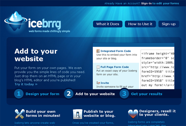
As one can see, the main lighting effect resembles an underwater scene, and can be related to the site title. That lighting effect is complimented with the semi-transparent content area. Also notice the slight lighting effect to the logo design. Adding subtle lighting effects on top of the main effect can add a lot of appeal as well.
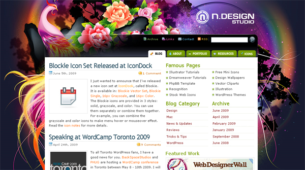
The background lighting effects are obviously not the only feature making this design amazing. It is a great example, though, of how lighting effects can add to any part of the design– whether it be the whole design, a logo, or in this example, an illustration. Nick La’s post, Vector Polishing Techniques, goes over these various techniques that he has become famous for, many of them being lighting techniques.
3. Use Image Detail
Many designers will create a main header or background image, and close down Photoshop for the rest of the design process. This a huge mistake. Adding small image details to buttons, headers, and specific content areas can add a lot of detail to a design, creating more appeal and focus.
The travel website above uses image detail in various spots. For example, the navigation, menu background, borders, and even the submit button for the search bar.
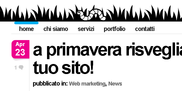
The above is a great example of how blog design can benefit from extra detail. The design above features a lot of whitespace and is very simplistic. The extra detail on the post date, comment icon, and color added to the active navigation element in the above screenshot already adds so much. If you visit the site, you will also notice details in the search bar, other navigation elements, etc.
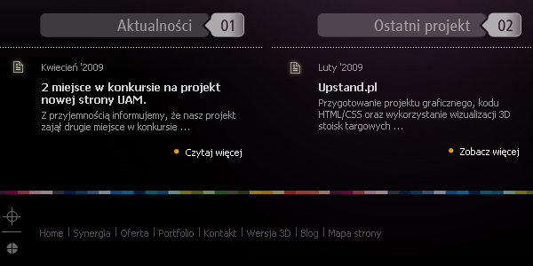
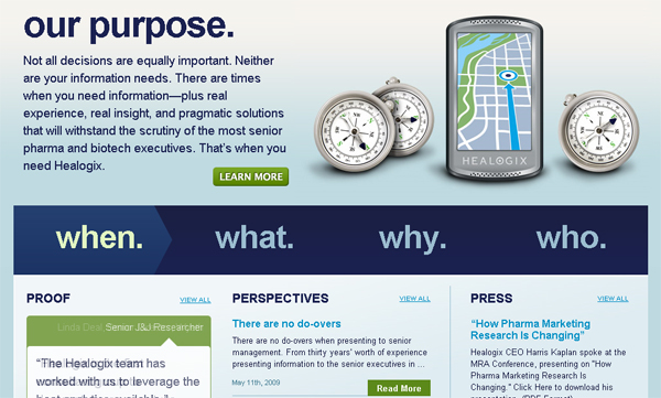
This design adds image detail to the headers, a very common and effective trick when using this technique. One will also notice icons and unique borders used throughout the design. The footer border is also very colorful, creating a great separation point.
4. Declutter and Add Whitespace
This doesn’t necessarily mean every design should resort to the minimalistic style. Any design style should pay attention to the amount of whitespace present in the design. Also decluttering or removing any content or elements that are not needed in the design will help bring attention to the elements that are really needed– as well as leave more room for whitespace.
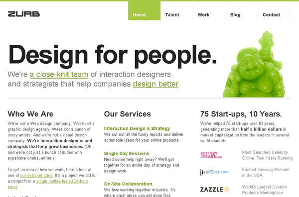
The extra spacing throughout the design aid in the visual hierarchy. One of the first components the visitor’s eyes are lead to is the navigation area. This area has a significant amount of whitespace around it. As I stated in A Guide to Simplistic Web Design, whitespace frames whatever it is around, and adds focus to the internal elements.
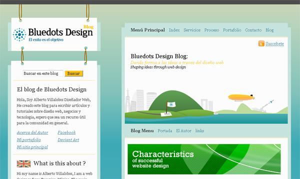
Be sure to consider spacing between the large, main components in the design as well. Drastic spacing between the content, logo, and navigation bar remind the visitor that they are separate entities, and allow the visitor to focus on each individually.
For websites that require a lot of content on the front page, even when decluttered, a smart use of spacing between paragraphs, headers, and images can create a content-heavy site that doesn’t look too busy.
5. Add Dynamic Effects
Most websites aren’t ready to enter the world of 100% flash, but adding smaller dynamic effects with, for example, jQuery, can create a sense of professionalism and aesthetic appeal that is bound to amaze.
There are a number of ways a designer can add a dynamic feel to a design, but because JavaScript is the most common way to do this, here are a few well-known techniques that are used.
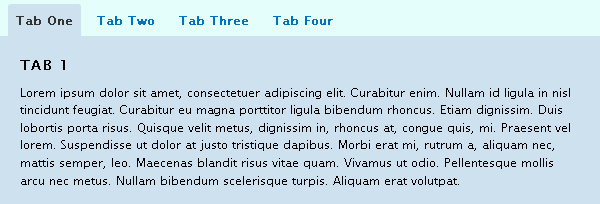
jQuery Tabs
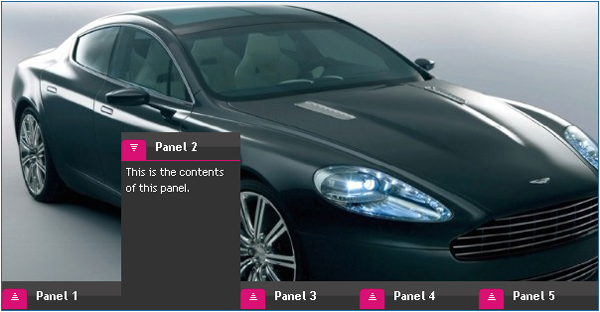
Carousels
Flash-like Menus
Lightboxes
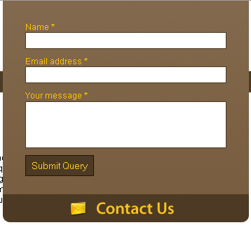
Fancy Forms
What are some of your techniques?
Please share some of your own techniques with design, or share if any of the above techniques helped you out!


