Design is not always everything. The following five websites are proof that design is not all that it is made out to be. If you focus your time, money, and energy into creating a killer service, you will come out miles ahead of those pouring their time, money, and energy into the design of their mediocre service.
Most webmasters place a high amount of value on the design of their website. Many webmasters have even spent significant amounts of money to insure that their website design was exactly the way they wanted it. It is commonly argued that well-designed websites are one of the keys to insuring recurring traffic. If people enjoy the look of a website, they will continue to return. Yet, this not always the case. Design is not always everything. The following five websites are proof that design is not all that it is made out to be. If you focus your time, money, and energy into creating a killer service, you will come out miles ahead of those pouring their time, money, and energy into the design of their mediocre service.
Chris Guitars
Chris Guitar’s is by far the ugliest website on this list. The official website/e-store for Chris Guitars in Albany, NY is e-commerce in its most elementary form. Chris Guitar’s is coded from top to bottom in HTML, complete with a “cheezy” graphic (albeit one that honors US troops and is therefore commendable). The website’s clashing color scheme of yellow text on a solid purple background is enough to make any shopper’s eyes bug out within the first minute of reading. Each product listing exists as a paragraph of product description and review along with a link to a picture of the item being sold.
Don’t the ancient design and super-simplicity fool you though. This guy does business. Chris Guitars has established itself as a sort of mecca for musicians and music equipment collectors. The simplicity of the website couple with the honest descriptions, pictures, and “best price on the web” make Chris Guitars exempt from any rule of good website design.
MMOFB Blog
The first three lines of this website tell all – “Don’t let the stunning graphics and good looks of this blog fool ya“. An obscure blogger writing under the anonymous pseudonym “Grizzly” has set out to prove that badly designed websites run by anonymous people can rake in cash. To see some of Grizzly’s handiwork simple query “make money online” into Google and you will see Grizzly’s blogspot hosted website appear within the 1st three spots of the SERPs (depending on the data center you access). Rather than relying on flashy custom WordPress designs, personal branding, and name recognition Grizzly has simply focused on good SEO.
Grizzly essentially contends that good design is needless, and that webmasters should focus on producing a quality service focused on growing organically. Do you think he is dead wrong? Check the numbers: 4000+ subscribers (more than 3000 more than comparable websites with flashy designs), and daily earnings ranging from $150 to $300 (compared to maybe that much in a month from comparable “well designed” websites). While many may cringe at the design of Grizzly’s blog, Grizzly himself would probably tell you that all well designed sights should be as ugly. The design of the MMOFB blog is the result of careful ad testing and analytics. The design hinges upon where the ads are most productive. With his cult following and earnings of $1,000+ per month from a free hosted blog – I am tempted to go and dishevel things a bit more on my own websites.
Plenty of Fish
The story of Markus Frind and his online dating website PlentyOfFish.com have garnered quite a bit of media attention from high profile publications such as Inc. magazine and many others. Frind is the first to admit that a boring and poor design is what makes the free dating site such a huge success. Frind’s strategy in creating PlentyOfFish was to build it and code it as minimally as possible so that it would consume the least amount of (server) resources as possible. The most glaring piece of poor design is the lack of proportional resolution on the thumbnail version of the photos. Based on interview with Frind, the disproportional thumbnails encourage more clicks, pageviews, and time spent on the site which ultimately results in more advertising exposure. The purposeful design flaws on PlentyOfFish.com have resulted in an estimated $10M in revenue for 2008.
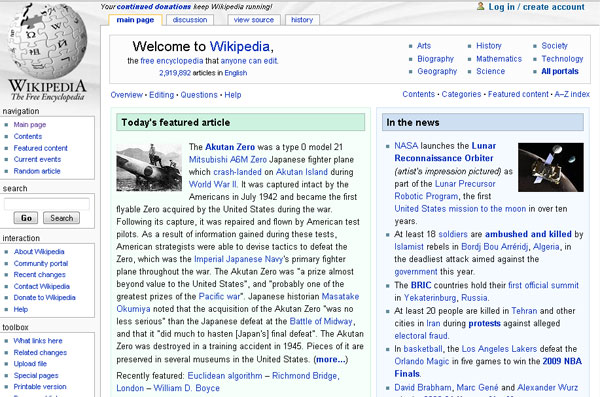
Wikipedia
Consider Wikipedia the epitome of the age old internet adage “Content is King”. By focusing their community on creating excellent fact supported content Wikipedia has essentially negated the need for well designed pages. While Wikipedia does offer certain modules and graphs to express data in a more organized fashion, the tables do little to balance the overall asymmetrical contents often left poorly spaced and formatted by pictures and other related resources.
Despite the relatively poor design and lack of eye appeal Wikipedia has established itself as the go-to resource for any online query, often showing up first in search engine results. The overwhelming existence of quality content and information often makes up for the lack of aestheticism, and lends itself well to the idea that academia should never be appealing to the eyes.
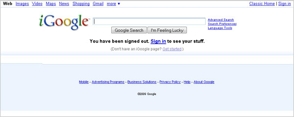
Wait…why is the big “G” on the list? Excellent question. Google’s design may not be intrinsically ugly, but it certainly is primitive. Google, the number one most visited website in the world, also understands that success does not rest in good web design. For Google, success rests within a superior search product and other solutions. When compared to other design-centric search engines such as Bing and the content ridden search services of Yahoo! and AOL, Google begins to look a bit boring. Google’s logo set (save for the commemorative ones) remains rather unspectacular as well. However, what Google may lack in flashy logos and content management, they certainly make up for with their superior services and offerings.
Questions and Conclusions
Five websites, five unspectacular designs. Does good design matter? Or is bad/boring/minimalist often used by designers intentionally to place a higher emphasis on the product and service. Should an excellent product or service be supported with flashy or cutting edge design? As a result of seeing these five websites, should a higher amount of energy be focused on website functionality and quality service development than on design?
One thing is for certain. Excellent products and quality design are not mutually exclusive. Excellent products can have excellent design, yet perhaps design should be one of those things that is gradually improved as time permits rather than thrust to the forefront of a project. If your website offers a quality product or a knockout service you should have no issues gaining users. The homework has already been done for you. Users care about functionality more than they do about design.


